Cities in the US
Data visualization of population density in major US cities
Overview
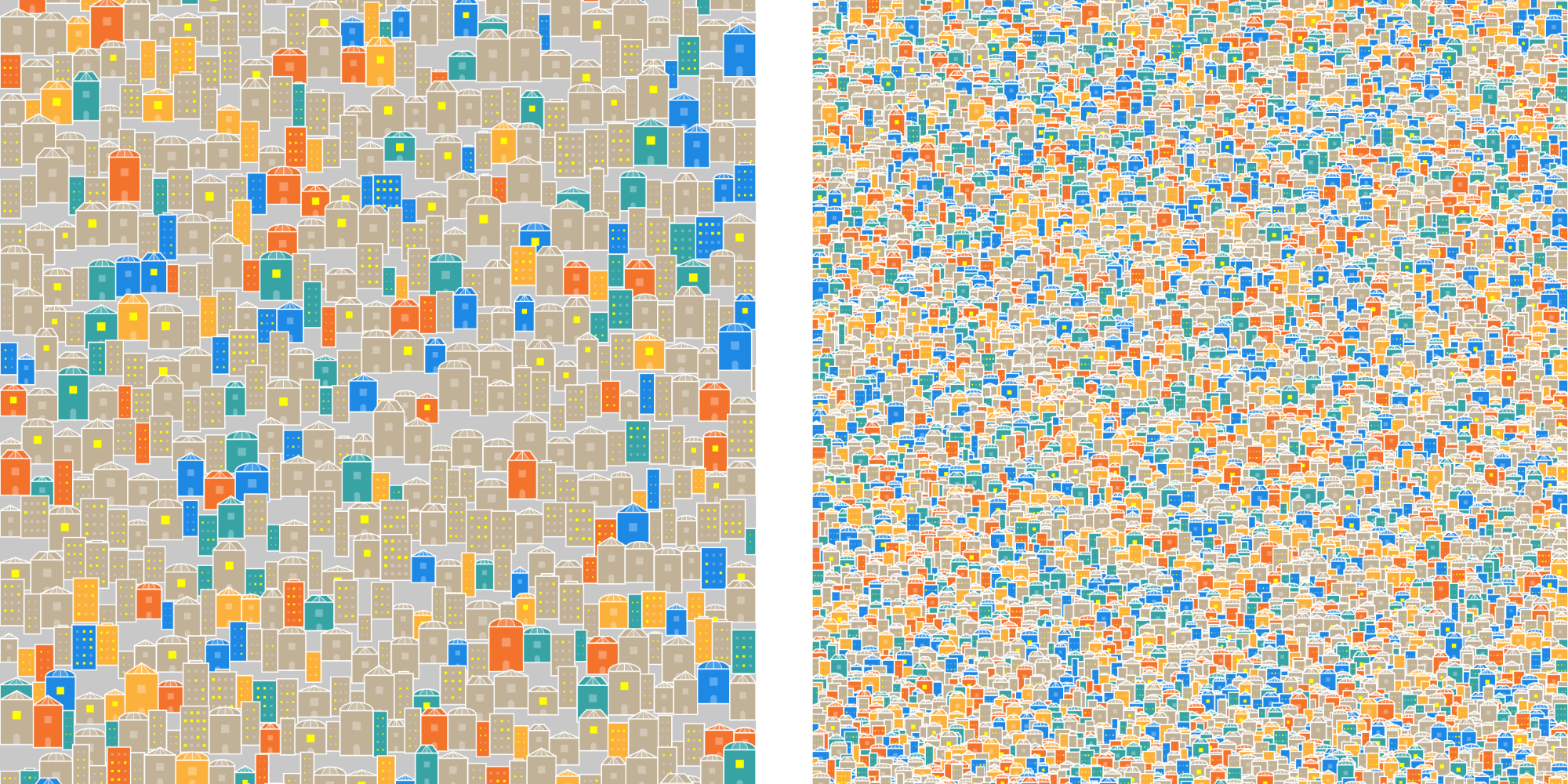
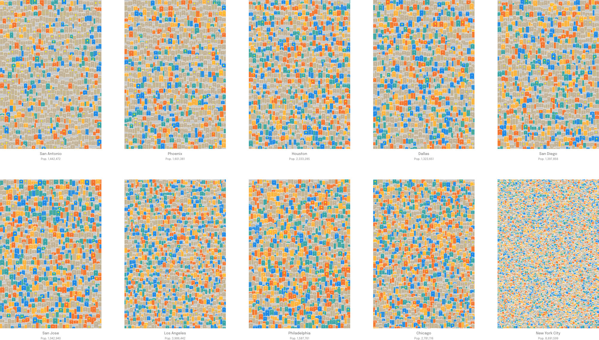
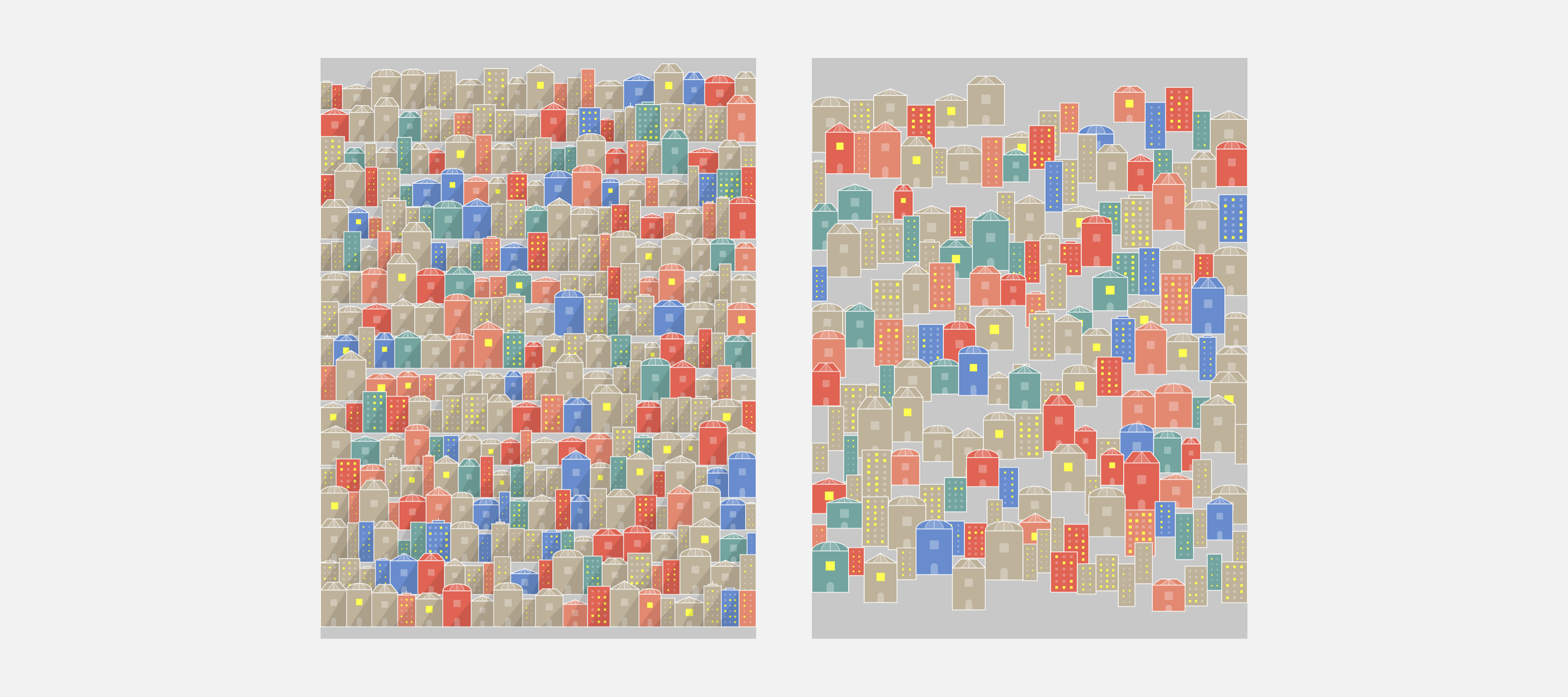
To rekindle my interest in data visualization and generative art, I wanted to put together a series of posters using a dataset of US cities I had found online. Made with p5.js, these are small visualization of cities in the US with populations of over 1 million people. The size of the buildings and how packed they are represent the overall population and density of each city, with New York City being a clear outlier.
I used a dataset on US Major Cities from Esri (filtering out cities with populations under 1 million).
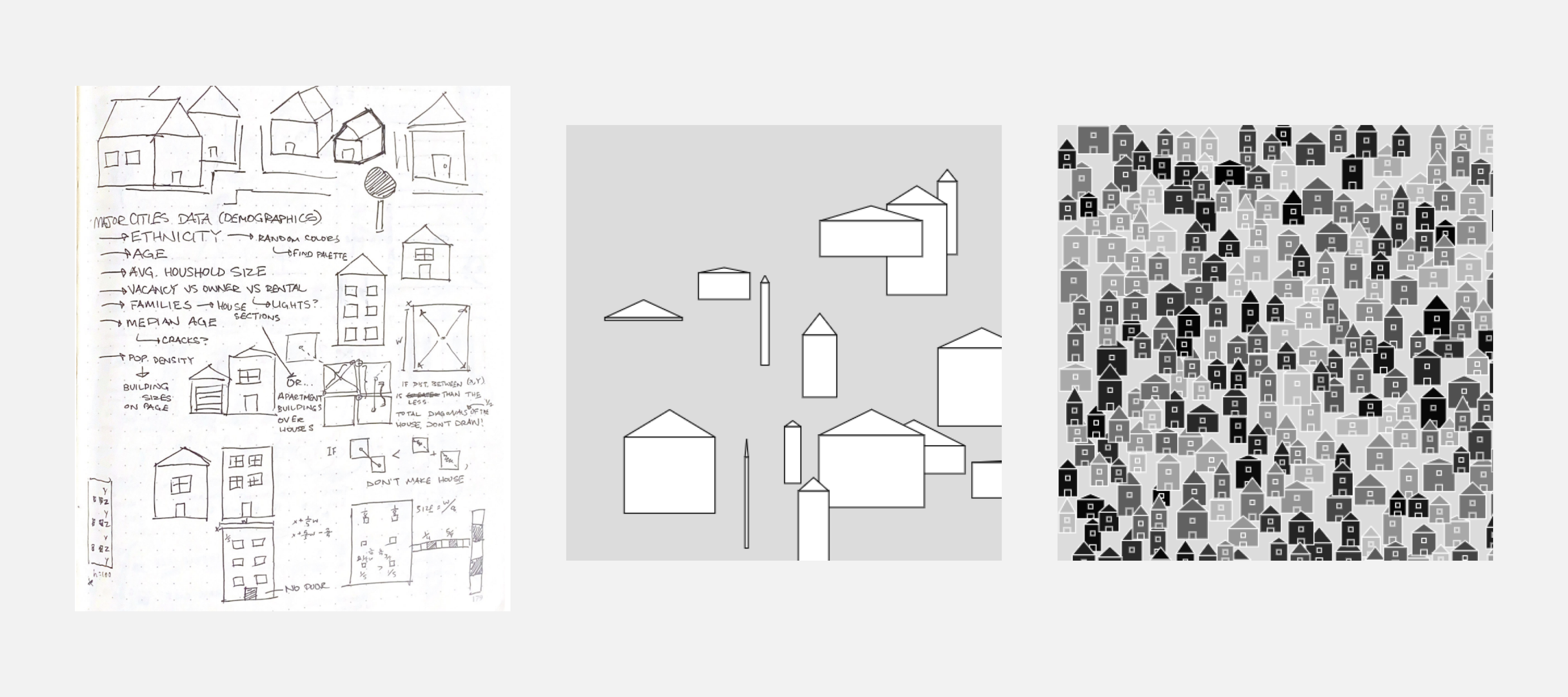
Initial Ideas
I jotted down a few ideas on how to use the various data columns, including average ages, vacancies, population densities, and ethnic group percentages to represent in a visualization. After narrowing down to a few categories that could more easily be represented by color and size, I played around with creating simple "house" and generic "building" shapes.
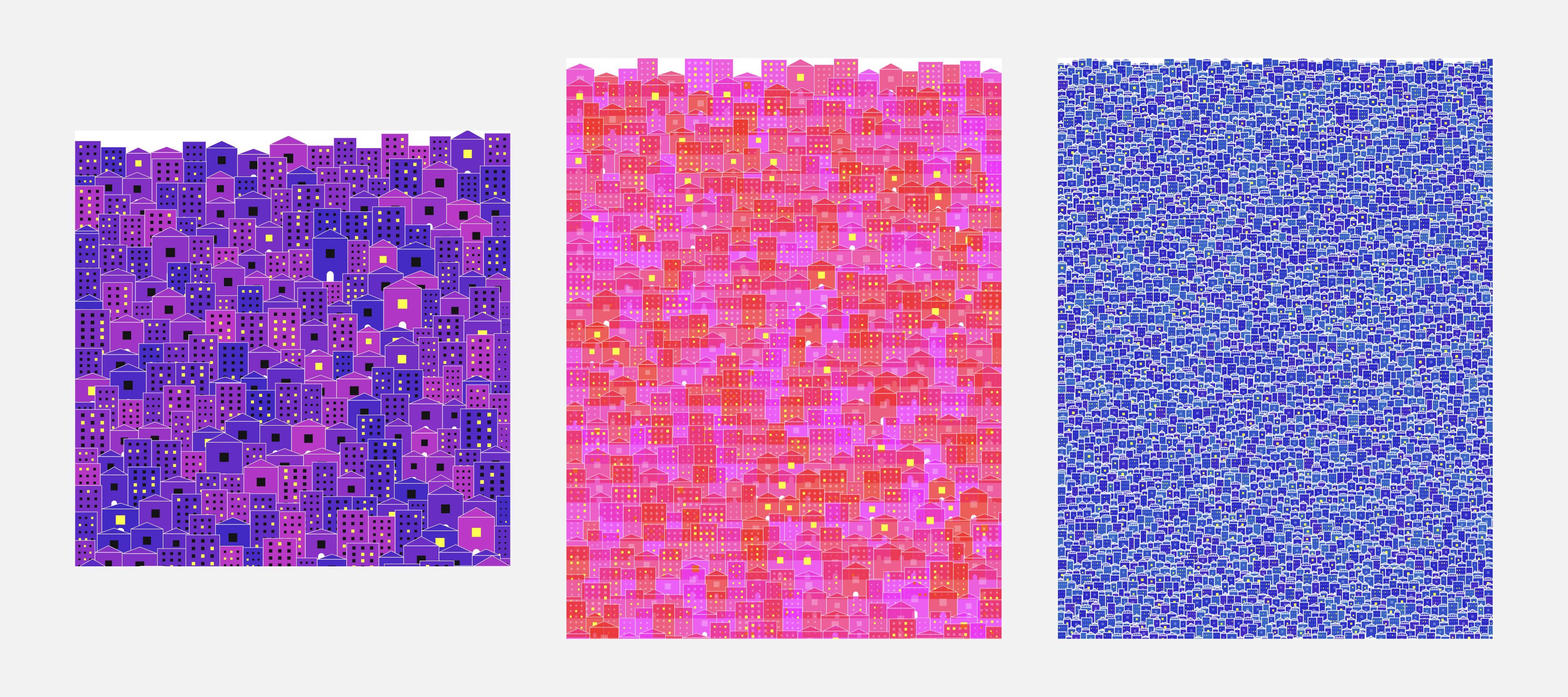
Colors and Shapes
I was curious to see how different color palettes would affect the overall look of the visualization. Though size could easily be determined by the density and population of a city, different color palettes could've led to confusion in determining why or how a city received a certain palette.
Final Adjustments
Having mapped the building sizes and colors to the dataset, I wanted to create a more chaotic visual to each visualization. I played around with varying vertical placements and adjusted accordingly to have a greater sense of random placement without too much overlap between buildings.