Dream Festival
Dream Festival is a web app that uses a person's top artists from Spotify to generate a poster for an imaginary music festival.
Motive
Inspired by the variety in music festival posters (as well as the disappointment in recent local lineups), I aimed to create a way for people to design their own posters from their favorite artists. I viewed this project as an intro to working with data from Spotify's API, and wanted to create a robust enough foundation so I can easily add new features in the future.
Beginning Ideas
One of the ideas I initially tried was having multiple lineups by day since many music festivals take place over the course of a full weekend.
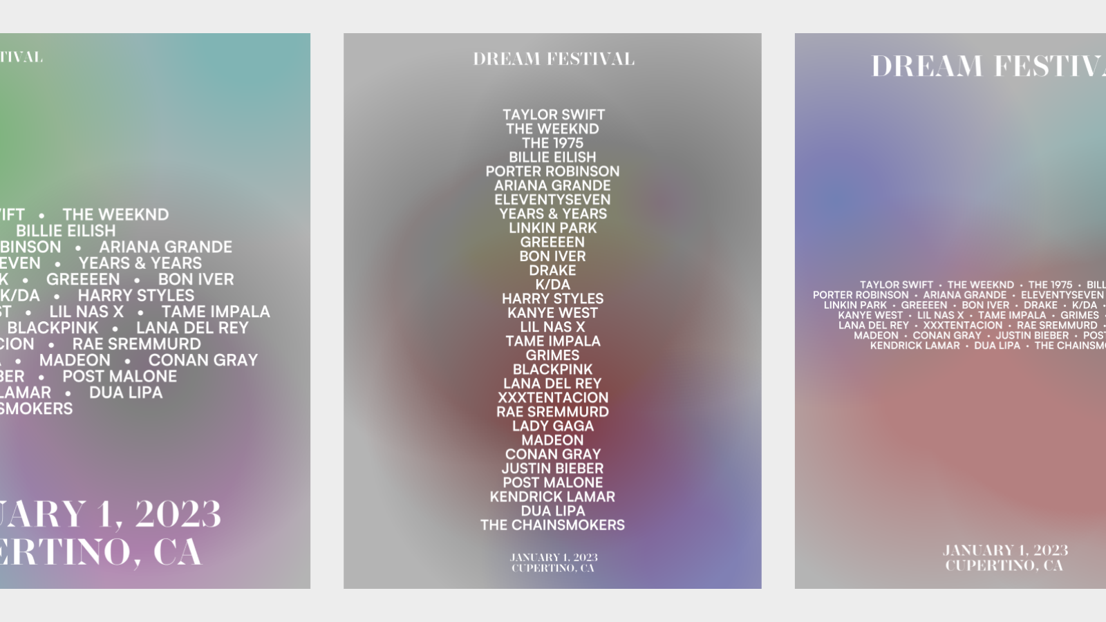
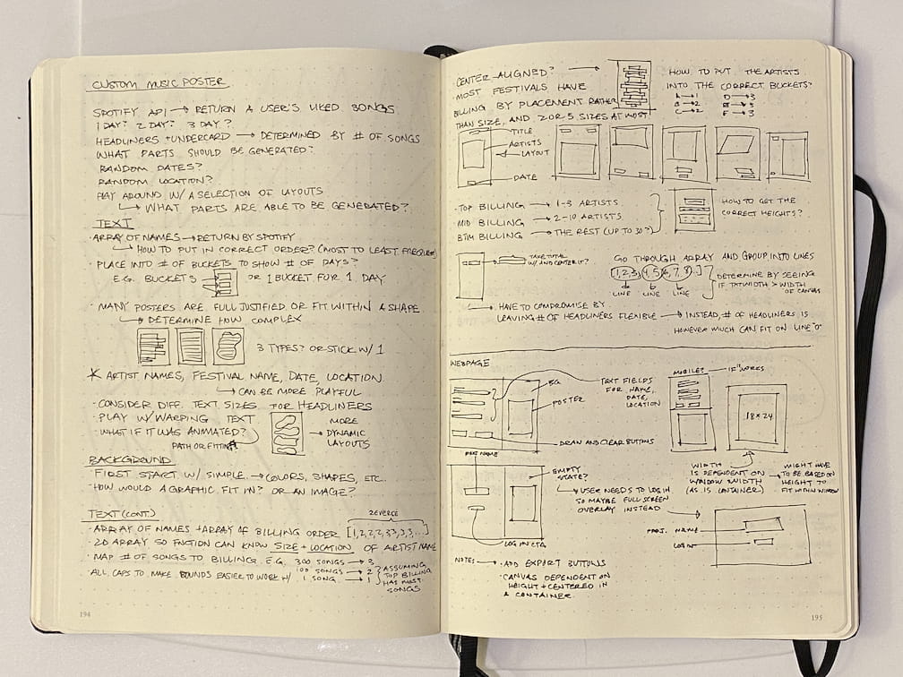
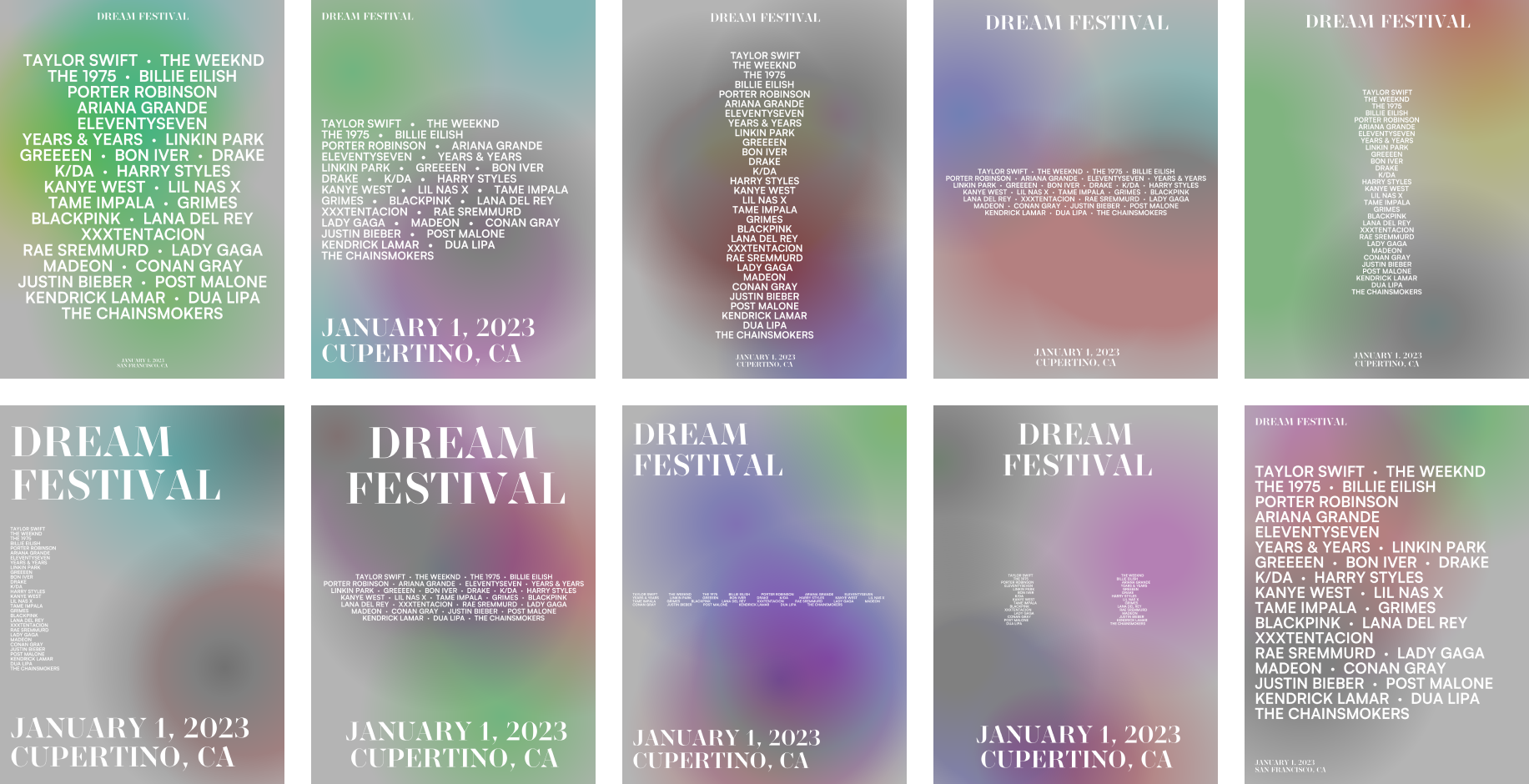
I started out thinking about what data should the visuals be generated from, and which parts should be customizable by the user. There were some concerns on my mind about the constraints of a generative poster versus one made for a specific event, mainly regarding using a broad visual identity when all the content differs from user to user. In the end, I opted for randomized colors with more faded gradients to keep a consistent visual theme across different posters without making it too specific.
Prototype V1
The main problem with the layout involved putting the line breaks in the correct places so that artist names with multiple words end up on the same line.
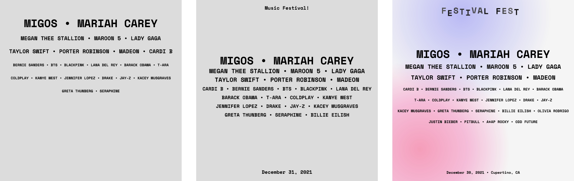
In the initial prototypes, I used placeholder data to figure out how to design the poster layout.Another issue was figuring out how to make sure the character(s) in between artist names aren't on the ends of each line. While solving these problems, I was also thinking how to highlight the festival info to make it more distinguisable from the artist names.
Prototype V2
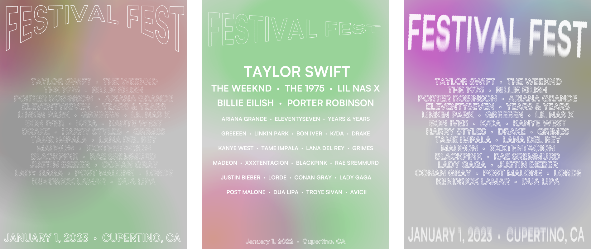
Around the time, I was exploring generative typography though an online course at Cooper Union so I tried out different ways to modify it and create a unique style.
After determining the layout and plugging in artist data from the Spotify API, I had a little fun trying out various ways to style the text itself. I came to the conclusion that perhaps a poster that's meant to be customized by the user shouldn't necessarily have an offbeat visual style.
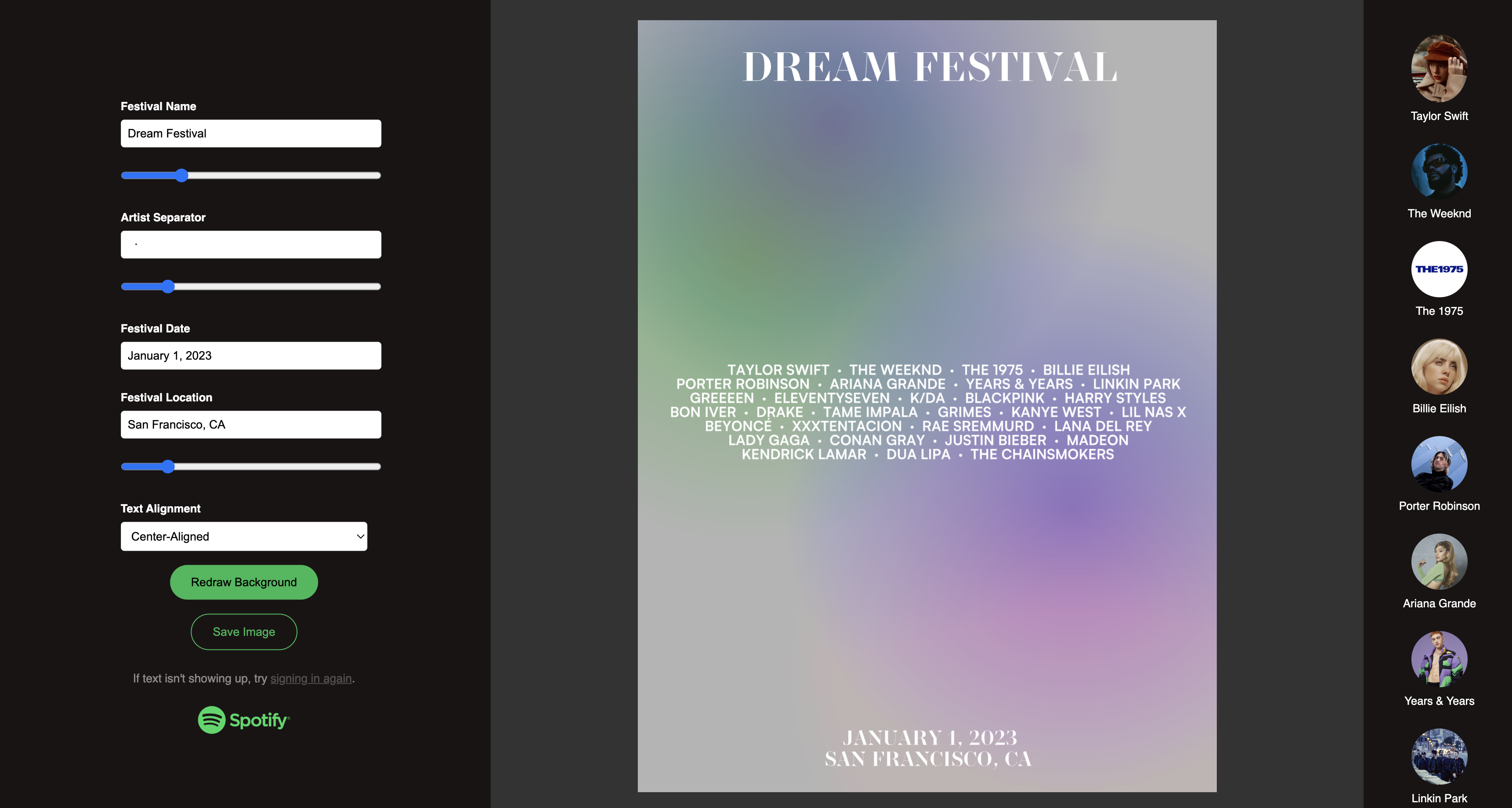
Creating the UI
I felt that leaving some sliders without a label added more to the exploration aspect and cleaned up the overall number of labels in the adjustable parameters as well.
My initial sketches had a simple layout that I stuck with for the UI, with the customizable parameters as its own section on the left and the poster output on the right. In the middle of the project, I rewrote parts of the generated poster to update in real-time based on the sliders on the left rather than forcing the user to click a button to update. Additionally, there's a scrollable sidebar on the right to provide Spotify links to a user's favorite artists.
Closing Thoughts
Branding for music festival posters tend to have beautiful visuals that are specific to the event details, such as the location, date, or music genre. Without definitive festival details, I felt that I had to give up a unique visual identity for sake of user customizability--in my opinion, the biggest hurdle of the project was striking that balance between the two.
In the future, there could be a lot of ways to add customizability and interesting features that use the digital medium to its advantage, such as adding visuals based on the user's music tastes (or location), and animating the poster background or playing around with the typography style more.