SoundHound

Music identification app on iOS + Android


Overview

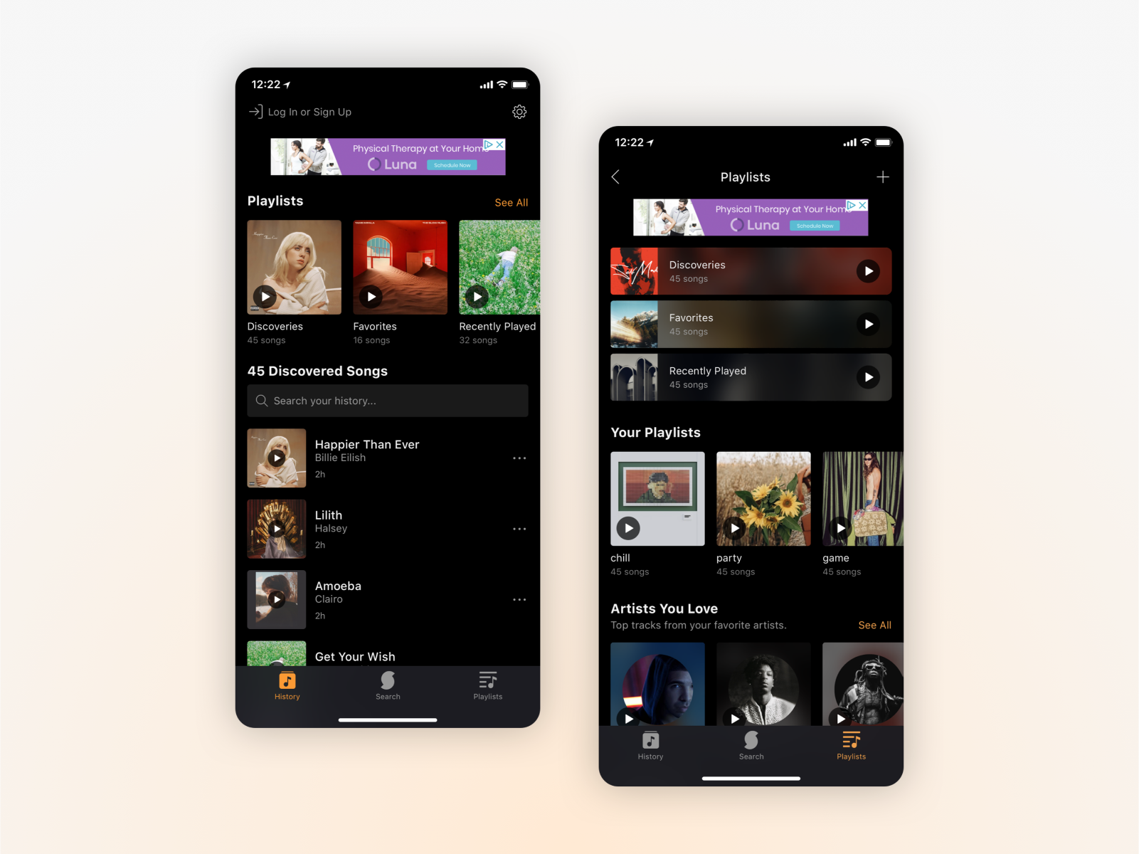
SoundHound is a music discovery app available on iOS and Android. While it has mainly been used as for music identification, the increased prevalance of streaming over the years has provided a new opportunity for growth. As a UX designer at SoundHound, I worked with a small team to bring new features and visual updates across the app on both platforms.

Playlists

As streaming became the most common way of experiencing music, we looked into how to incorporate a more personalized experience for SoundHound users. Playlists were created with the intention of helping users curate their discoveries, find music similar to their favorites, and overall expand the app's role from solely being for music identification.

Problem Space
Due to Soundhound's role as a music discovery app, it earned a reputation as a "utility" app rather than a "music" app. To grow the app's userbase and increase retention, we wanted to provide more functionalities to users who weren't a part of an existing streaming ecosystem.

Roles & Responsibilities
I worked alongside our user researcher, one product manager, and two engineers each for iOS and Android platforms. Playlists took around two months from planning to launch, whereas visual updates were more sporadic in their timing.

Initial Design & User Testing
We initially launched with a simple design of a playlists page to gauge user interest and did some user testing to gather feedback on what they wanted in such a feature. Many users stated that they preferred a curation of music based on their listening habits and favorites, and that a discovery app such as SoundHound should curate based on their discovered songs. Following this, we created a second phase design that focused on these requests and emphasized the newly-added feature of creating one's own custom playlist.
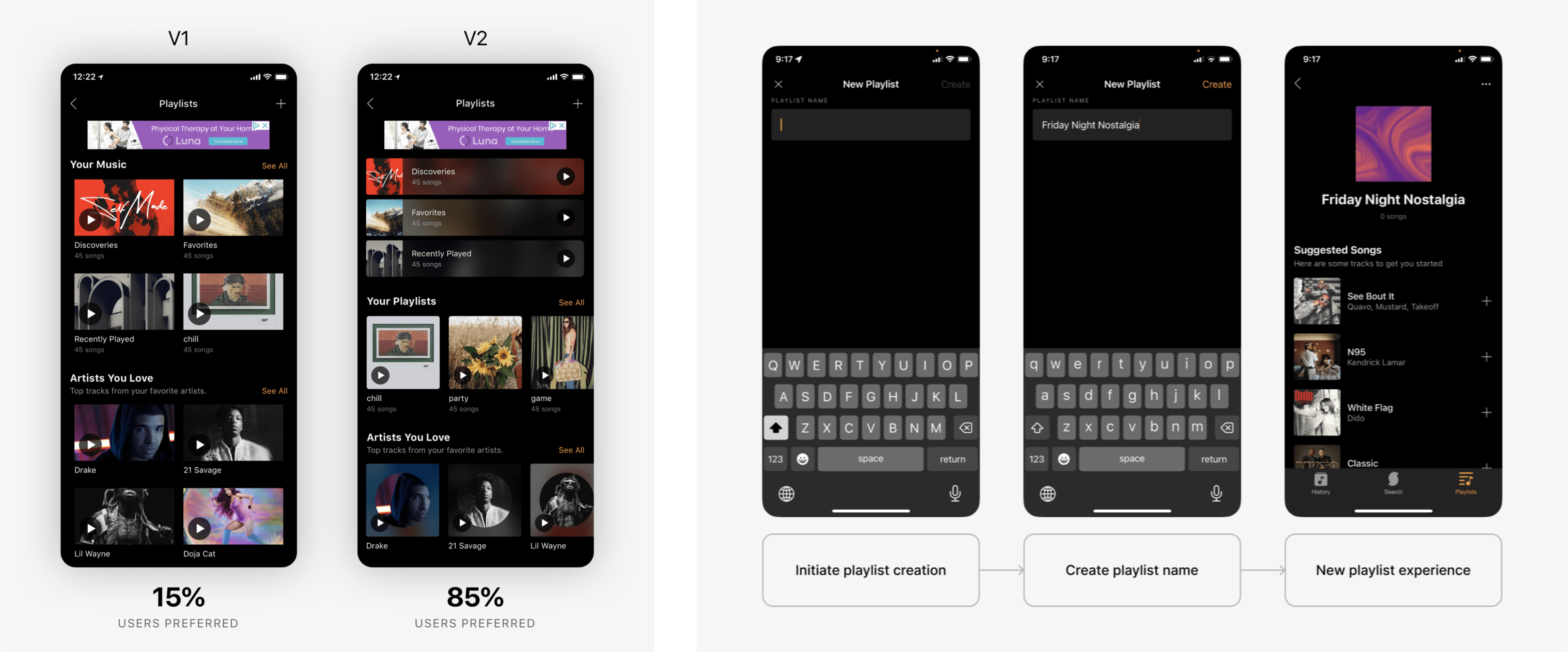
In a user polling session, we found that a strong majority preferred the new design with side-scrolling and main playlists at the top.

User-Created Playlists
Playlist creation was a feature implemented soon after the initial launch of playlists. We did some competitive analysis to understand more about playlist naming and new playlists experiences, eventually moving forward with a full-screen modal and suggested tracks to help guide users.


Tags & Notes

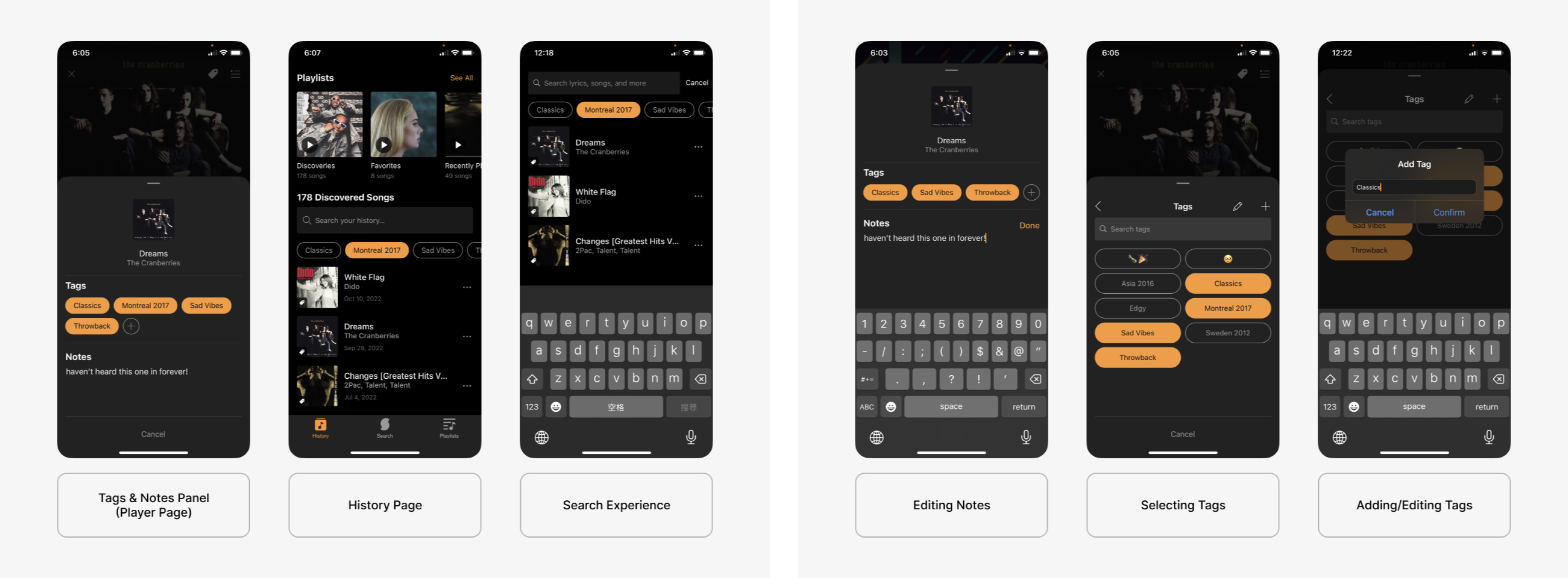
One of the new features we worked on was Tags & Notes, which is a new way for users to label their music library and add notes to songs however they wanted to. It also provided a way to help filter one's music library in a customizable manner.

Problem Space
Some of our users had sent in feedback requesting easier ways to filter through their discovered songs. Additionally, our user polls had brought up the idea of tagging songs that had sentimental meaning to them. With Tags & Notes, we aimed to add a filtering aspect on top of a “journaling” or “labeling” feature.

User Research
We polled our existing users on how they currently used the app; many noted that it was usually to identify a song they had heard before (“What was that song again?”). A common theme throughout the responses was nostalgia, and many of them seemed receptive to the idea of tagging one's songs to categorize their discoveries more easily.

Entry Points
Our team decided on three ways to access the Tags & Notes: the main History page, the Player page, and through the Search functionality.

For the Player page, we tried out some designs that utilized the lyrics panel as well as a horizontal scrolling experience beneath the player controls. As Tags & Notes were ultimately a secondary feature to the main controls, we decided to move it to its own modal accessible from the player page's top bar.

Editing Tags & Notes
While initial designs had an “edit” icon whenever there was a tag, we thought it'd would be a cleaner UX to move editing tags to a modal in the player page. From there, users could create new tags and choose which ones correspond to the which ever track's page they were on. We also de-prioritized editing over selecting tags, as we did not expect users to continuously need to edit tags they created.


Visual Updates

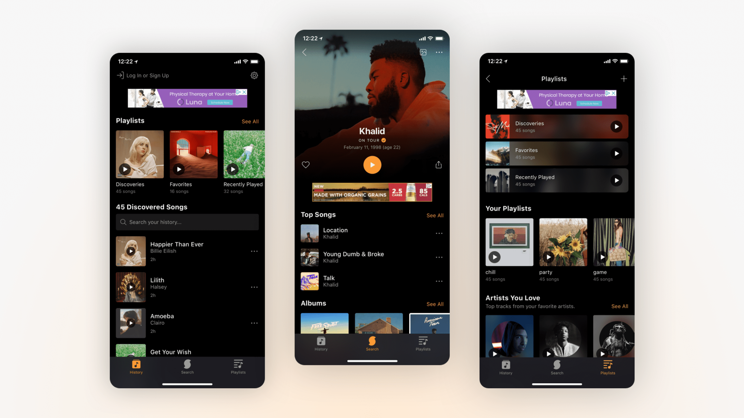
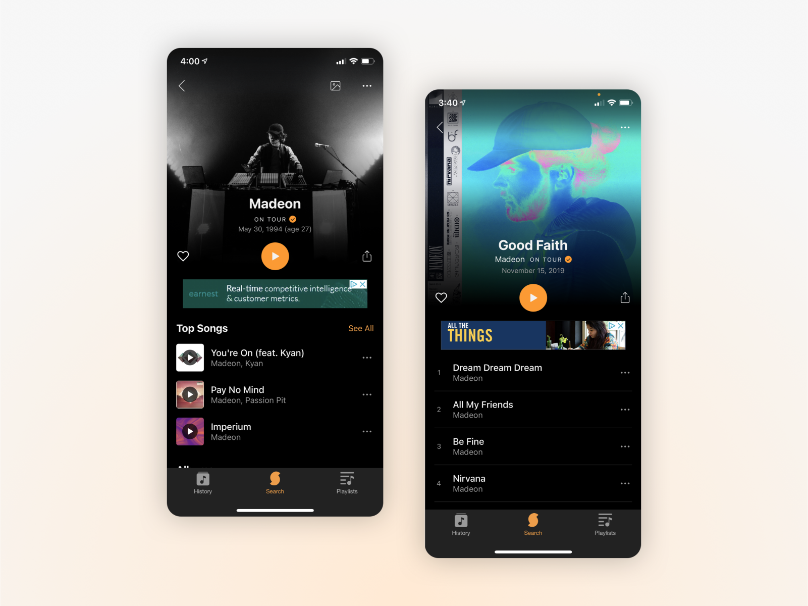
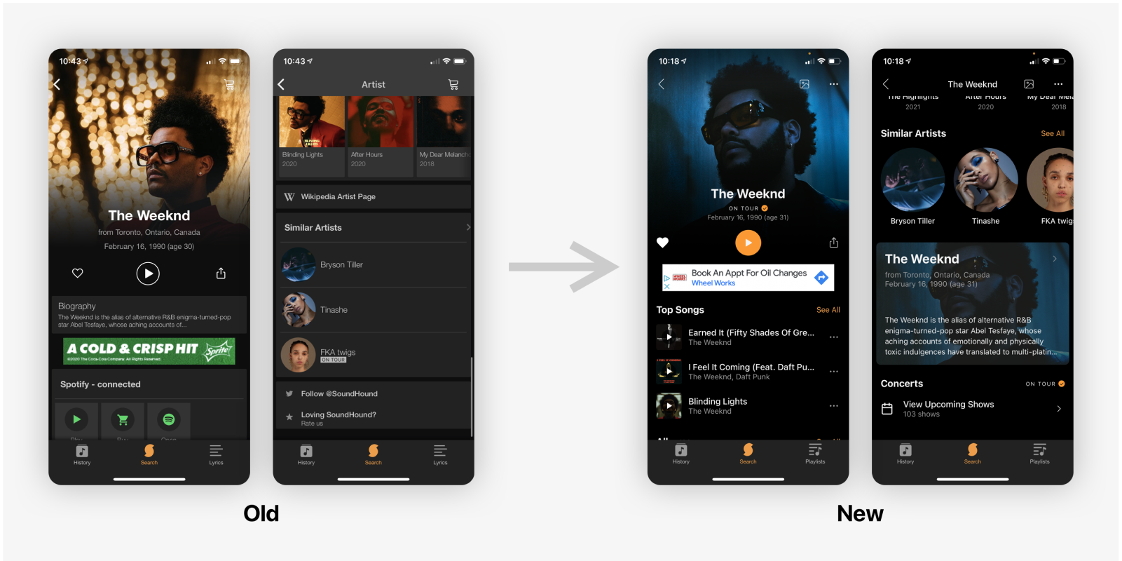
In line with playlists, we wanted to expand the functionality of the app beyond just a music-identifying utility. Our team decided that an important step to achieving that goal would be to modernize the look of the SoundHound app. Our updated style guide utilized the SoundHound orange to highlight links and buttons, while using a black background to bring emphasis to the music-related images.
Artists & Albums
We worked as a team to re-order the information on the page and provide a strong emphasis on music streaming. This led to bringing the artist's top songs above the screen fold, and relegating secondary info such as the artist's biography to the bottom of the page. Pages such as the artist's image gallery are more accessible (by tapping an icon) versus being hidden behind an unintuitive side-scroll in the old design.

Settings
Under the settings page, we reduced the number of sections and removed parts that were either no longer of use or options that were not applicable to the vast majority of users. We chose to order the sections based on interaction rates from our current users, with the most important sections towards the top. Vague section titles, including the app's tutorial on voice control, were further clarified with updated copy changes.


Outcomes

While new features such as Playlists and Tags & Notes, as well as the visual overhaul overall had a slightly positive impact on user retention, it did not bring an increase in new users as we had initially hoped. Since our data had shown that a small percentage of users explored beyond the music discovery page, moving forward we'd have to think of creative ways to promote new features without interrupting the existing music discovery UX.